Fundamentals of Harmonious Design: An Overview of the Balance Concept
===================================================================
Learning graphic design can be an exciting journey, and one of the fundamental concepts to master is balance. In this article, we'll explore the different types of balance in design and how they can be used to create visually appealing compositions.
The Types of Balance in Graphic Design
Primarily, graphic design balance consists of symmetrical balance, asymmetrical balance, and occasionally radial balance. Each type affects the visual stability and aesthetics of a design differently and has specific applications.
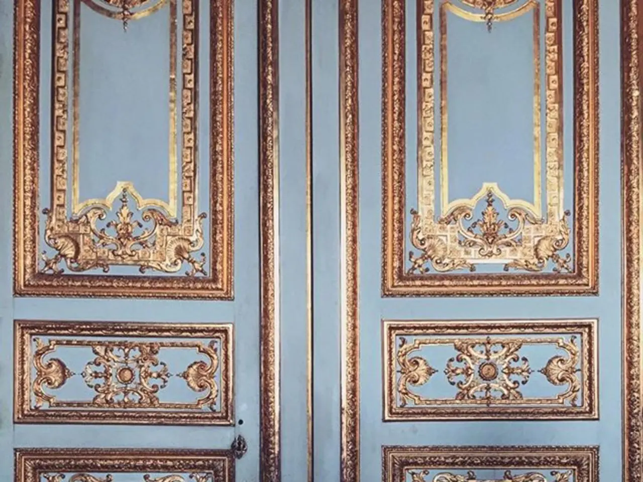
- Symmetrical Balance creates harmony, formality, and a stable, organized look by arranging elements evenly on either side of a central axis. This type is often used in logos, formal documents, and designs requiring a sense of order.
- Asymmetrical Balance arranges elements unevenly but achieves balance through visual weight, creating interest and dynamic compositions without symmetry. It is common in photography, digital app designs, and logos.
- Radial Balance (less commonly discussed) arranges elements radiating from a central point, producing a circular harmony often seen in mandalas, circular logos, or decorative elements.
Additional Balance Concepts
Beyond these main types, balance concepts based on axis include vertical balance and horizontal balance. Vertical balance refers to the distribution of visual weight above and below the horizontal center line, while horizontal balance concerns how visual elements are placed along a horizontal line.
Applying Balance in Design
- Logos: Symmetrical logos evoke trustworthiness and formality; asymmetrical logos offer dynamic, modern appeal.
- Photography and Layouts: Asymmetrical compositions guided by the rule of thirds enhance viewer interest and visual flow.
- Digital Design: Balancing visual weights in app mockups or websites ensures user interfaces are visually pleasing and navigable.
Best Practices for Using Balance in Design
- Balance doesn't require a fifty-fifty division or mirroring of identical visual elements.
- Balance doesn't necessarily mean equal weight for all elements; it means no single element overpowers the design.
- When deciding on the type of balance to use, consider the objective and how best to get the message across.
- A grid pattern can also help ensure each section is evenly balanced in a composition.
- Mosaic balance (also called crystallographic balance) is a type of balance where elements appear chaotic but have an underlying organization, best suited for unconventional or more abstract designs.
- Lack of balance in a design can result in visual tension and a design that is not visually appealing.
- White space and repetition can be used to achieve balance in design.
- Discordant balance (also called off-balance) is a type of balance where elements aren't balanced at all, which can make viewers uncomfortable and stop them in their tracks.
The Importance of Balance in Design
A balanced composition is more pleasing to the eye and, depending on the type of balance chosen, can create a feeling of order. Paired with a clear visual hierarchy, balance makes a design digestible at a glance. Practice is key to learning how to use balance in designs, and our platform's templates and user-friendly drag-and-drop editor make it easy to experiment with different types of balance.
For more specific graphic design tips, check out our post: 11 Actionable Graphic Design Tips for Beginners, According to Design Experts.
Technology can playing a crucial role in enhancing one's lifestyle by offering various tools and resources for learning graphic design, such as online tutorials, design software, and digital platforms that provide templates and editors.
Incorporating the right balance of elements in graphic design using concepts like symmetrical, asymmetrical, and radial balance, as well as vertical and horizontal balance, can significantly impact the technology-driven user interfaces of modern devices, ensuring they are visually appealing and user-friendly.


